Overview
Redesigning Cognizant’s global footer to support the new meganav
During my internship on Cognizant’s web team, I was responsible for rethinking the global website footer. Cognizant had recently launched a new meganav at the top of the site, but the footer still reflected older content structures: long columns of links, vague headings, and uneven spacing. My goal was to redesign the footer so it felt like a natural extension of the new navigation, helped people find what they needed, and could be implemented reliably across global
Problem Statement
The existing footer was cluttered and out of sync with the new navigation
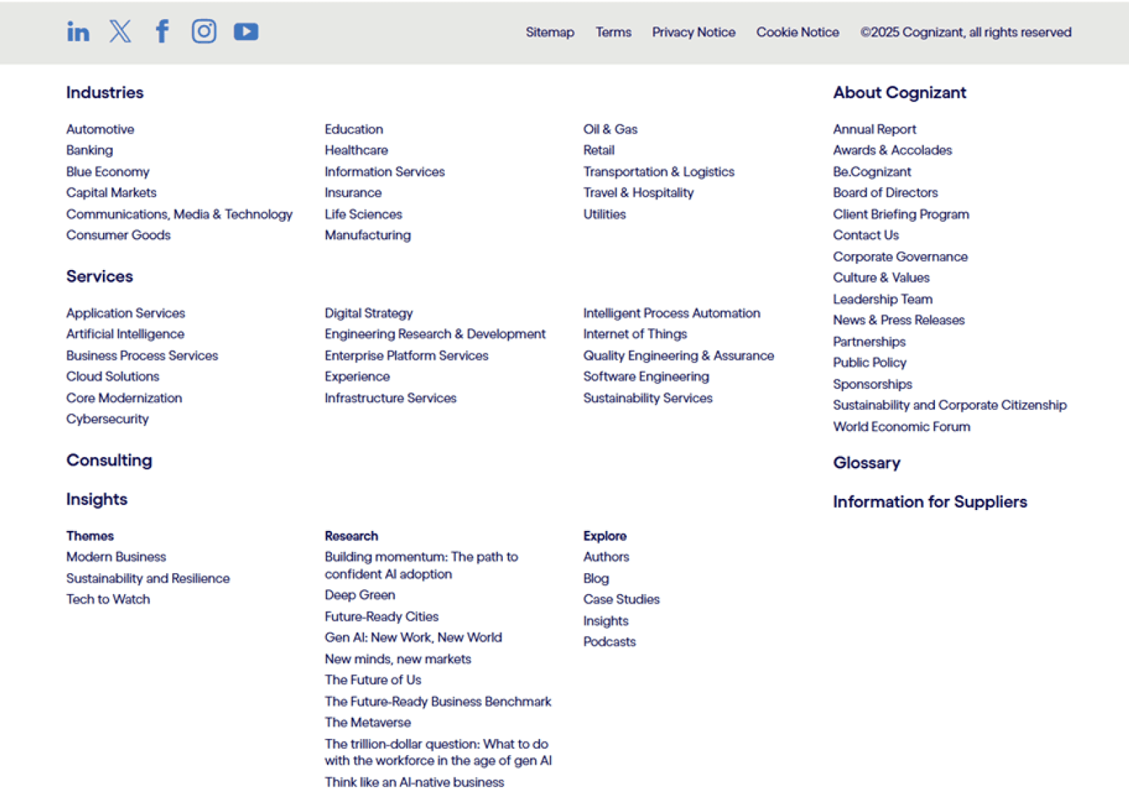
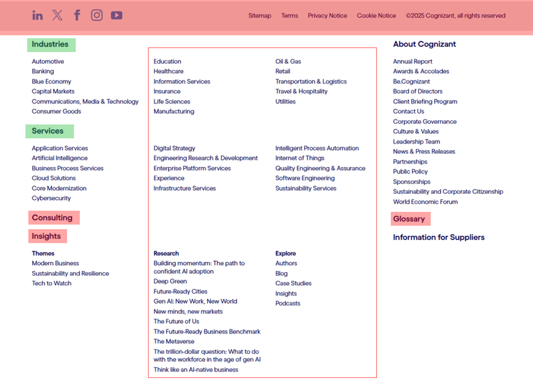
The legacy footer had grown over time as different teams requested links. New links were added without a clear strategy. Old ones were rarely removed. Headings were vague. Some sections had many more links than others.
User feedback described the footer as overwhelming and hard to skim. At the same time, the new meganav at the top of the site was organized and intentional. The footer no longer matched that experience. Instead of guiding visitors to useful next steps, it often left them confused or scrolling.
Users & Audience
Designing the footer for real users
I focused on people who treat the footer as a safety net. This included prospective clients who want to explore services and industries, job seekers who look for careers content, and partners or press contacts who need official information or a way to reach the company.
The footer also needed to work for internal teams. SEO and web stakeholders use it to surface high priority pages and reinforce trust with links to privacy, terms, and legal content. The redesign had to support both sides without turning into another long list of links.
Scope & Constraints
Designing a footer that works for users, SEO, and a global site
The project covered the site-wide footer on Cognizant’s main web properties during the course of my summer internship. The new design had to support the updated meganav, which meant the footer could not compete with it or try to act like a second full navigation system. Instead, it needed to reinforce the structure at the top of the page and offer clear next steps.
Beyond that, there were several practical constraints. The footer would be built in Adobe Experience Manager using existing component patterns. It had to include specific legal and policy links and remain accessible on both desktop and mobile. Because Cognizant operates internationally, the pattern also had to handle regional variations and translated text without breaking the layout. SEO priorities influenced which pages needed visibility and how headings were worded. All of these factors shaped the final structure and kept the design honest about what was actually possible to maintain.
Timeline
Surface
Site
Tools
Scope
Constraints
Summer 2025
Site-wide footer on cognizant.com
Enterprise, multi-region web experience
Figma, WEVO
Research → Audit → IA → Visual design
Meganav alignment, SEO, legal, global, AEM
Process Overview
Research → Audit → Collaborate → Strategy → Design
Competitive Analysis: Studied competitor footers for best practices.
Research: Studied competitor footers and best practices.
Audit: Used WEVO insights and my own review of the current footer.
Collaborate: Aligned priorities and wording with SEO, web, and brand.
Strategy: Defined the footer’s structure and role beside the meganav
Design: Created and presented responsive footer mockups.
Competitive Analysis
Learning how strong footers work and where ours fell short
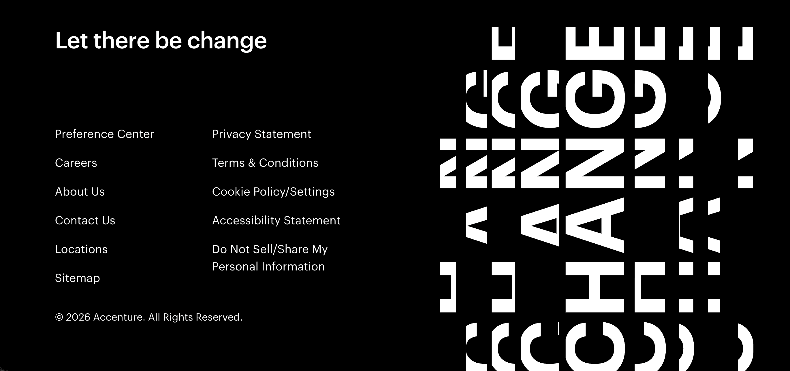
I started by looking outward at how other large companies handled their footers. I reviewed enterprise and B2B sites like Deloitte, Accenture, Infosys, IBM, EY, Google, and Meta to see how they grouped links, handled careers, contact, and legal content, and where they drew the line on how much to include.
High-performing footers tend to use very straightforward headings instead of clever or branded language. Labels like “Careers,” “Contact,” or “Resources” make it obvious where to look, even on a complex site.
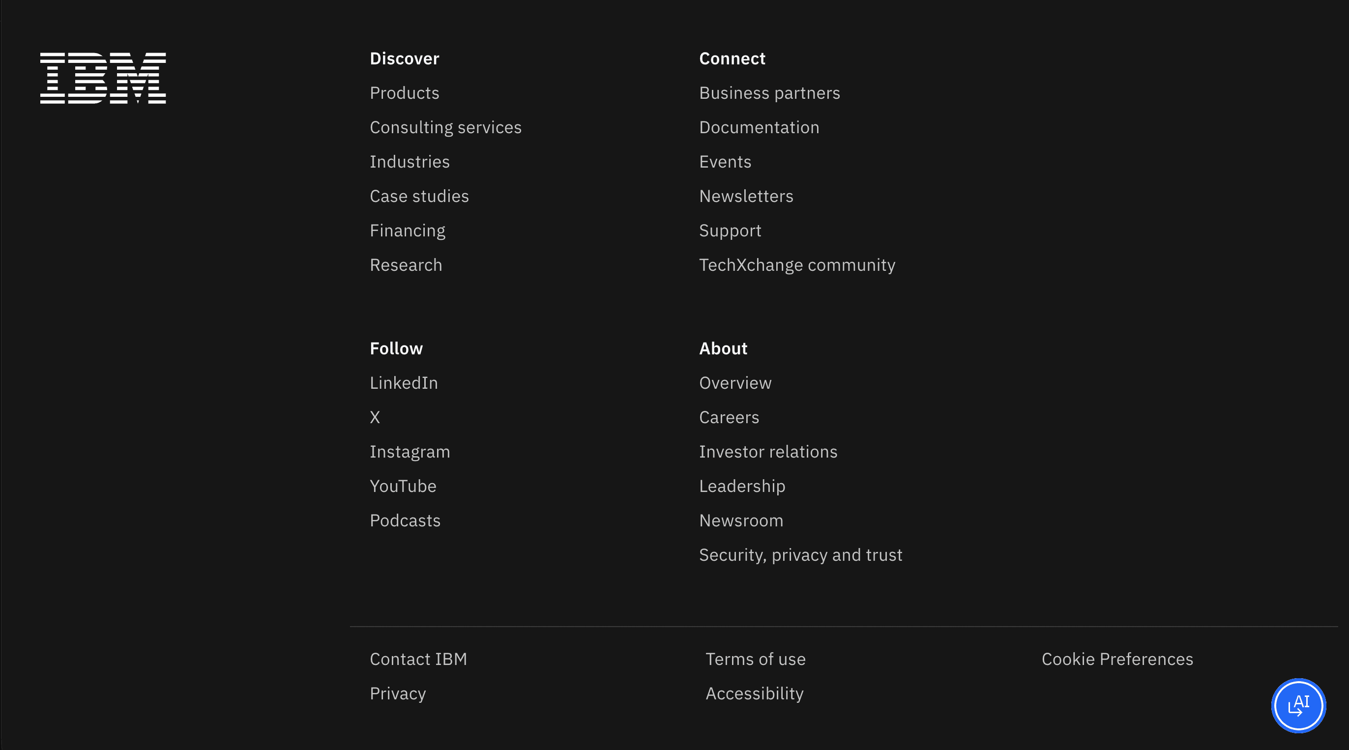
Across multiple enterprise sites, footer content is broken into a few clear sections. Each section keeps the number of links manageable, which makes it easier to quickly scan rather than read through long lists.
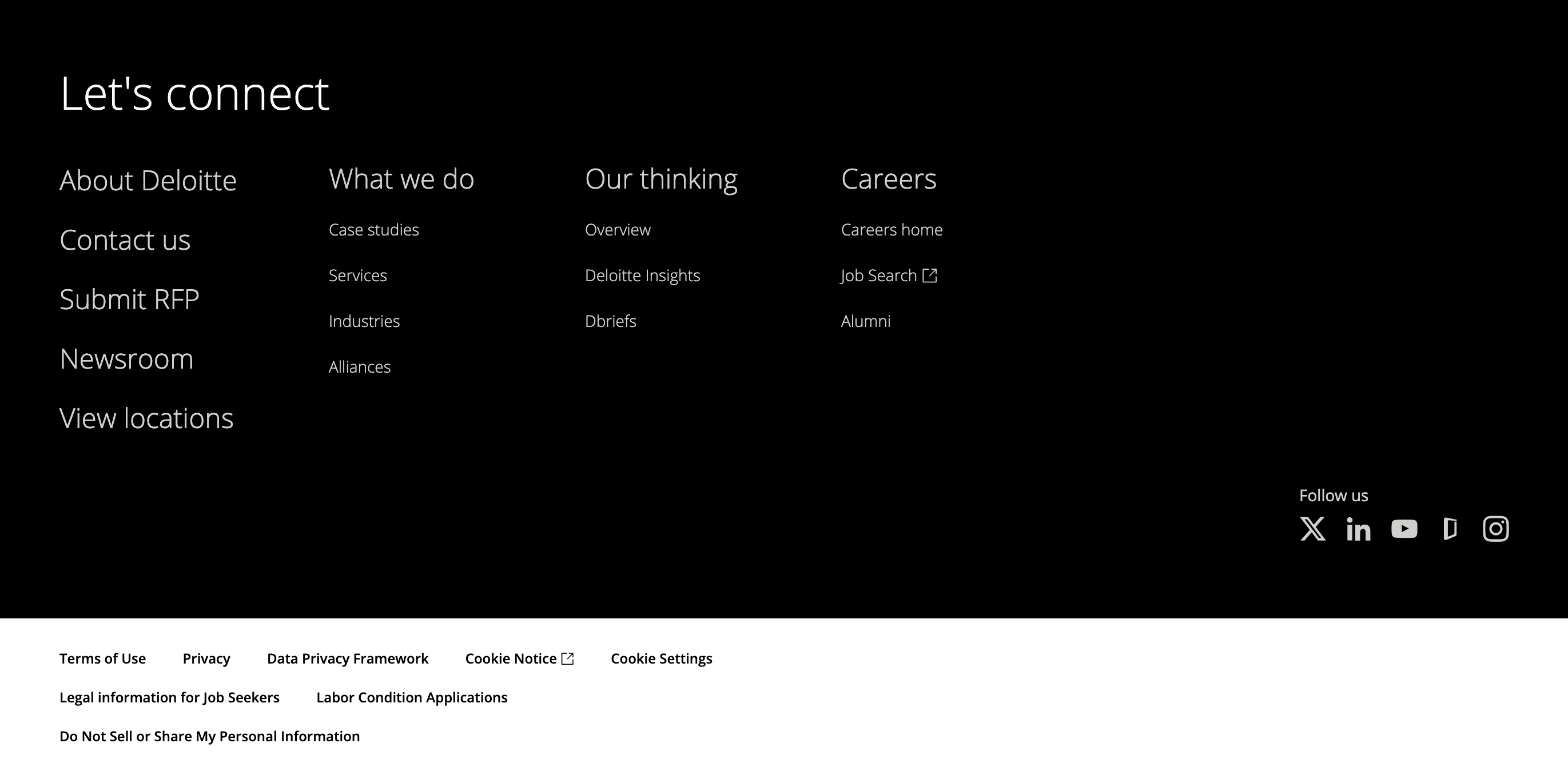
The strongest examples use a calm, minimal layout with good spacing and a clearly defined area for legal content. The overall pattern stays consistent from page to page and can adapt to different regions or languages without breaking.
General Research
What research says about how people use footers
I then read articles and best practice guides on footer patterns from design firms such as Nielsen Norman Group and Forge & Smith to understand what users typically expect at the bottom of a complex site. This gave me a baseline for what “good” looks like before changing anything on Cognizant’s side.
Why people scroll all the way down
When nav fails, footer is the backup
They expect “official” info to live here
Looking for a clear next step
How people scan footer content
Scan section headings first, links second
Ignore long, dense link lists
Grouped links are easier to skim than mixed lists
What draws the most attention in footers
Contact options and “Get in touch
Careers and job-related links
Trust content: privacy, terms, cookie settings
Audit
Reviewing the current footer through users’ eyes
I combined WEVO testing feedback with my own walkthrough of Cognizant’s footer to understand how it felt in context of the new meganav. I noted which sections people relied on, where they felt overwhelmed or confused, and how the layout made scanning harder than it needed to be. This turned a vague sense of “clutter” into a concrete list of issues to fix.
Collaborate
Working with SEO, web, and brand to refine priorities
Once I understood the problems, I met with SEO, web, and a brand lead who specializes in wording. Together, we talked through which pages truly needed footer visibility, which terms mattered for search, and how we could phrase section headings in a way that felt clear and on brand. These conversations shaped which links stayed, which ones could move elsewhere, and how the footer needed to differ by region. By the end, I had a clearer sense of what the footer was responsible for and where it should support the meganav instead of repeating it.
SEO
Helped prioritize which pages actually needed footer visibility
Pushed me to use clear, literal link labels for search and users
Web
Flagged which links were hard to maintain across regions and AEM
Helped decide what belonged in the footer vs meganav or page content
Brand
Turned vague, buzzword-y headings into clear, user-friendly labels
Reinforced the idea of keeping ~5 or fewer links under each heading
Strategy
Turning research and feedback into a clear footer structure
I pulled together everything from the research, audit, and stakeholder feedback to define a simple strategy for the footer: what it should do, what it should show, and how it should support the meganav.
Footer as a safety net - Focus on key last-step actions, not a second full navigation.
Group by user intent - Organize links by what people come here to do, not by internal teams.
Support the meganav - Reinforce the top navigation and remove links that simply repeat it.
One pattern, regional flexibility - Use a consistent layout that can swap links and languages by region.
Highlight high-value areas - Make services, industries, careers, contact, and legal easy to find fast.
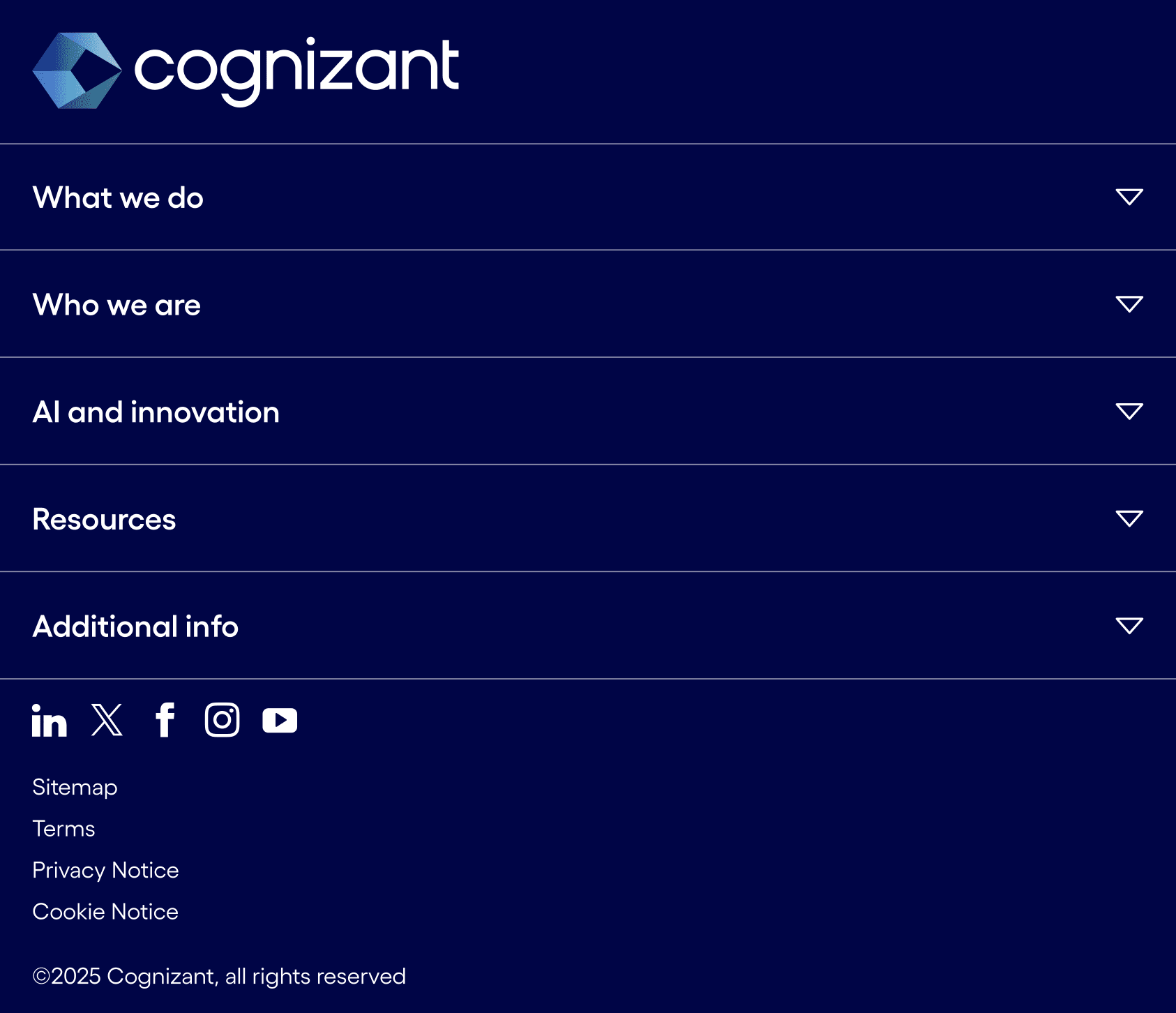
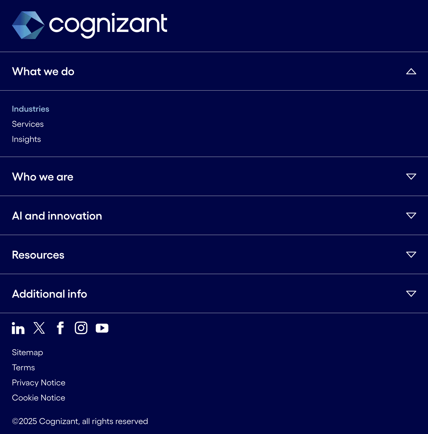
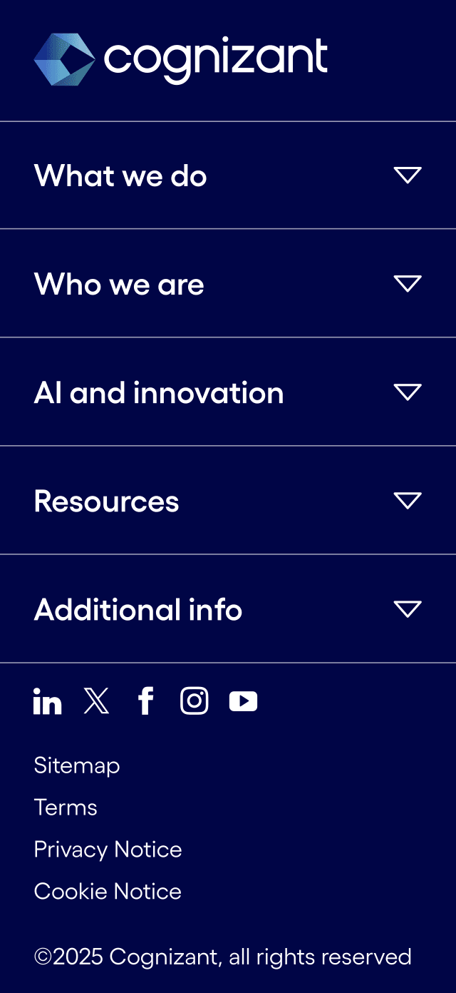
Design
Designing and presenting responsive footer mockups
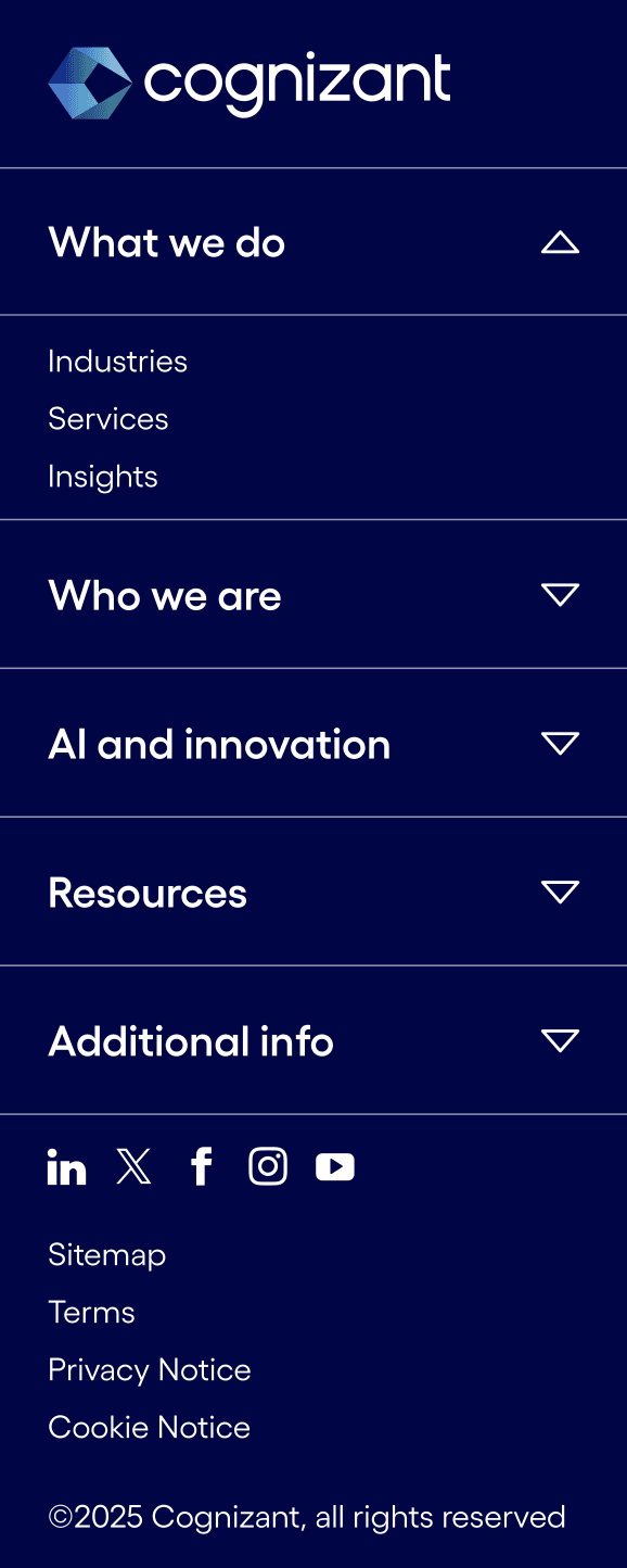
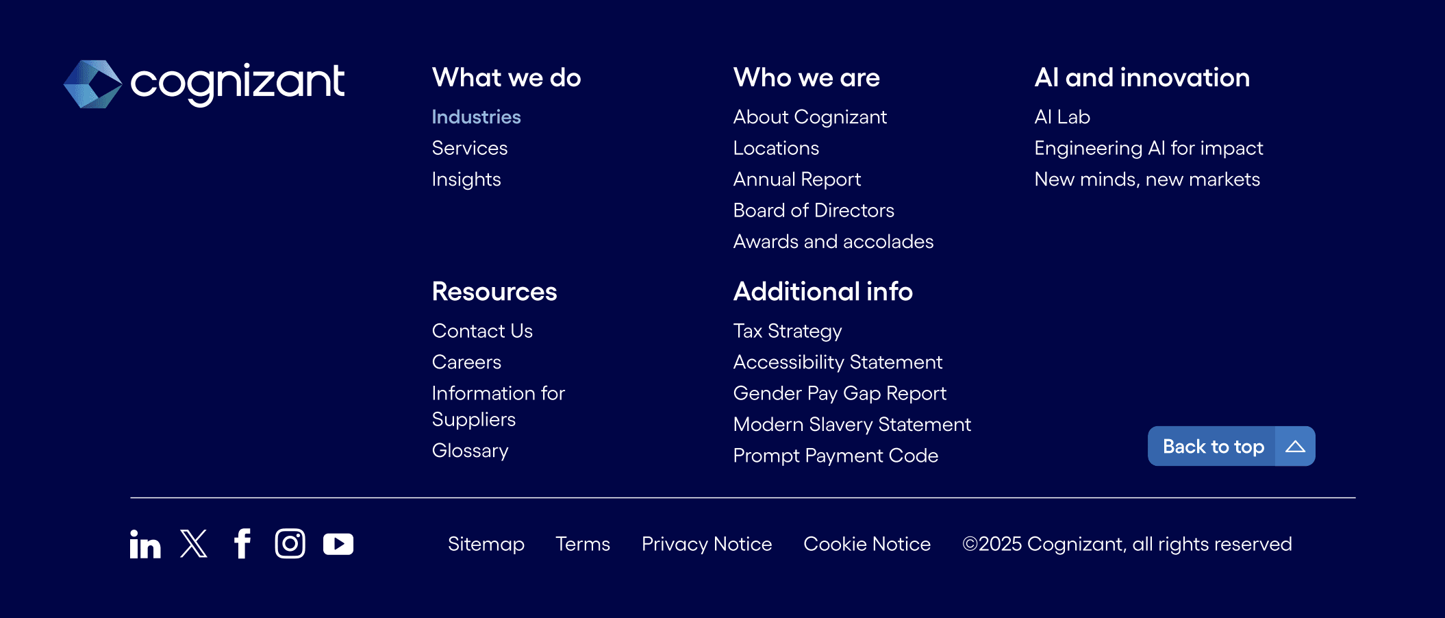
Sticking to the strategy, I moved into Figma to explore how the new footer should look and behave. I used Cognizant’s existing type styles, colors, and spacing, and designed desktop, tablet, and mobile versions as reusable components. After refining details like spacing and hover states, I presented the designs to the web team and walked through how they could be built in Adobe Experience Manager and adapted for different regions.
Desktop
Tablet
Tablet Expanded
Mobile
Mobile Expanded